We currently have clients using our snippets to automate workflows. The functionality is great, however can you please add an option that changes the appearance of the snippet?
The current appearance makes the snippet look like its made in windows 2000/XP era with the sharp edges, old form appearance, dated drop downs, dated radio buttons, etc. It would be great to have a few options that change the overall appearance to look much more modern, aesthetic and professional. This instills confidence in our workflows.
Currently i see a few clients having doubts in the functionality simply because the appearance of user interface looks dated. This is a purely visual update request to improve confidence and usability. Hope that makes sense
Thanks for taking the time to share your thoughts with us. We'll take another look at how our form elements look and feel, and we'll let you know once we have any updates about them.
I agree with this one, more options for cosmetic and aesthetic purposes would be great, like for example more button shapes and such. however, you can actually make it look "modern" using the elements that Text Blaze offers right now (with some work lol)
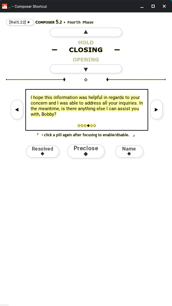
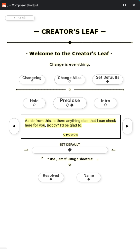
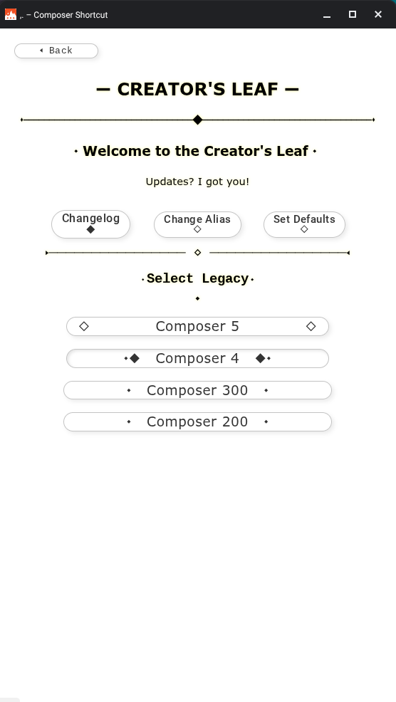
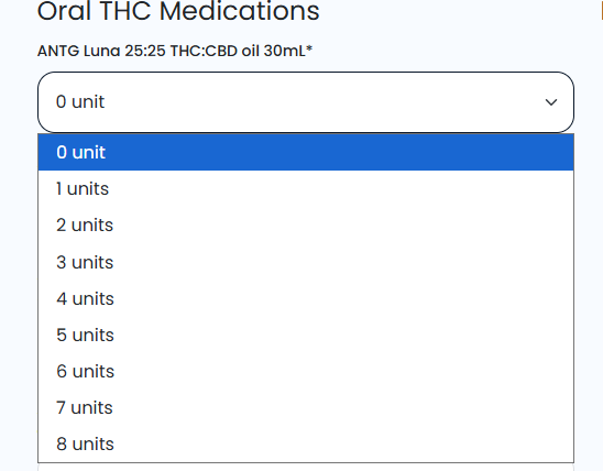
Here is an example of the snippet that I have made for my colleagues:
Please see above as some examples. Possibly multiple visual theme options? You could have modern, retro, minimalist etc. themes that would change the appearance of all Textblaze functions accordingly.
Maybe a wallpaper option for company branding? Underlaying gentle graphics or visual themes on the final form.
In a nutshell, im trying to make it look like our professional company software rather than something that i quickly created at home in my spare time. Although my Textblaze forms are complex and very functional for our company's needs, visually it looks like something that was made 20-30 years ago which doesn't instill confidence in the user.
A separate idea to take the functionality further, is the ability to open and fill other snippets once you have the started the initial snippet. These snippets would then be connected with shared data inputs. The ability to switch back to the prior snippet, and fill more details if needed. A final insertion feature could insert the data of the connected snippets accordingly. Almost like clicking on hyperlinks on a webpage and returning to prior webpages to change entered data, like when setting up an account on a website or completing a task that requires multiple webpages.
Hello, hope you doing good, I have been taking a look at the snippet you made and is actually amazing, I am really interested in knowing how you did that, is there a possibility you can share how you did it so I can take a look, thanks in advance
I share the sentiments. However, at the same time, I find that there is a simple elegance in the Blaze UI. Sometimes it’s better to not have all the visual bells and whistles when users just need to get through the work quickly and accurately. Depends on the users, workflows, etc. I think a relevant case would be made for any side of the story. Overall, TB has made significant enhancements over the past 18 months…growing abilities and features exponentially. I do think that giving more attention to the visual elements of the
UI/UX would have tremendous value though.
Hello! @rohan.r@Aldo_Barahona, sorry for the late response. Due to the nature of my organization and snippet (work related) it contains sensitive information, as well as limitation of sharing a folder. However, I could provide some of the tricks that I figured out and learned throughout the making of "Composer".
Here is the link of the page that I am working on so far, it'll explain some of the techniques that I used: